Had an assignment to do three moodboards for my “Interactive” Web Design class using Photoshop. Basically using a collage technique utilizing images & elements ripped off from the web. Due to a seemingly unending series of obstacles, I only had a few days to complete what was supposed to be a three week assignment. I’m a few days late, so my grade is already docked, and I did a bit of a rush job on a lot of this, so I’m not expecting much in the grade department. The assignments were 1.) fun & youthful (my idea of what youth actually like varies considerably from what my instructor thinks, so I convened an impromptu “focus group” for this one); 2.) corporate & traditional: I was bored to tears after viewing about a couple dozen of various corporate sites. There’s usually a header with the corporate logo, followed by a row of links, followed by a rectangular panel of banal “on the job” photos (probably lifted from some “no-royalty” stock image site) done using flash (and which could have been done just as easily using jQuery, and consequently using much less in the way of system resources), then about four or five bolded bullet points containing links– then yet another row of links and (as I see it) an unneccessary copyright notice which pretty much constituted the footer of the page. Gimme a break!
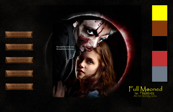
Lastly, there was the obligatory “cutting edge” site– not a lot of which is to be found on the web anymore. Most artists there days (it seems) are using WordPress for their sites, so they can easily update their sites to advertise showings and events. I decided to jump on the next (de)generation of teen romance: namely, the Great American Zombie Romance Trilogy. But, natch, being entirely too bored with the subject of the turbulant emotional life of teenagers, I jumped right to the chase, creating a parody of a Twilight movie advertising site:

